Two weeks ago I published an article titled: “Beyond technical features: why we need to talk about the values of the Fediverse (part 1)” in which I described how the Fediverse has made me a better digital citizen.
I thought I could cover this topic in one blog post but got carried away describing the core values of the Fediverse:
– fostering genuine connection (as opposed to the engagement bait and vanity metrics of Big Tech platforms)
– protecting privacy and enforcing consent (especially when it comes to publishing photos of minors)
– championing accessibility
If you haven't had a chance to read that blog post, you can find it here:

That post quickly ballooned into a long article requiring 10 minutes of reading time, so I decided to wrap it up and cover value number 3 – championing accessibility – in a brand new piece. So here we are.
What is accessibility and why is it important?
Ryan Bracey, director of Web UX at the agency Second Melody, described web accessibility in a interview for the Wordpress community podcast Press This:
Web accessibility is the idea that everybody should be able to access the information that is on the internet. Full stop. You as a human browsing the internet should have no issue in accessing that information, regardless of what your personal situation is - if you are a person living with disabilities especially.
Web accessibility is a fundamental human right.
When you start seeing things this way, you may react with surprise, consternation and anger when you observe how most mainstream social media platforms do not encourage the use of tools like alt text - adding text descriptions to photos to make them accessible to anyone.
As @alttexthalloffame brilliantly wrote:
A picture is worth a thousand words. Unless you don't add #AltText. Then it's just "Image".
Approaches to accessibility: Threads vs. Mastodon leadership
Earlier this year, Meta CEO Mark Zuckerberg posted a series of screenshots of a very long article to his Threads account. Without using any alt text.
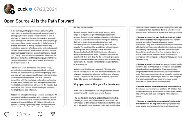
I remember coming across this somewhere on Mastodon (sorry if I cannot credit the original poster). I was APPALLED by the complete lack of awareness on Zuckerberg’s part that these screenshots would not be accessible to people with visual impairments who use screen readers.
The irony here is that Zuckerberg posted screenshots of a long post on Threads – his own text-based social media platform. Why not break up the text into an actual long thread?
Zuckerberg has 4.6 million followers on Threads and is one of the most influential people in tech. He should have known better.
Let’s compare Zuckerberg’s terrible online etiquette to the postings of Eugen Rochko (@Gargron), founder of Mastodon, who is a prolific photographer and always makes sure to add descriptive alt text to his images. Like this one:

A woman with a nose ring and dark hair that's been dyed slightly purple, wearing black clothes and a choker, holding a can of cider while sitting in a camping chair on a field of grass. In the background, there are camping tents.
Source: https://mastodon.social/@Gargron/113260798014642933
Championing accessibility is baked into the DNA of the Fediverse.
A personal mea culpa
I have been really active in the Fediverse since this spring. Something I realized right away was the importance of adding text descriptions to all my images, so that they would be accessible to anyone.
I will sheepishly admit I rarely did that when I posted on Twitter 1.0 or Instagram. I don’t remember seeing any prominent prompts to add alt text to my photos when using these platforms.
Just to make sure I didn’t misremember things, I logged onto Twitter for the first time in eons to check if my posts with photo attachments had alt text.
A few of them did but most didn’t.
A post from November 2022 had alt text, while another from December 2021 didn’t.
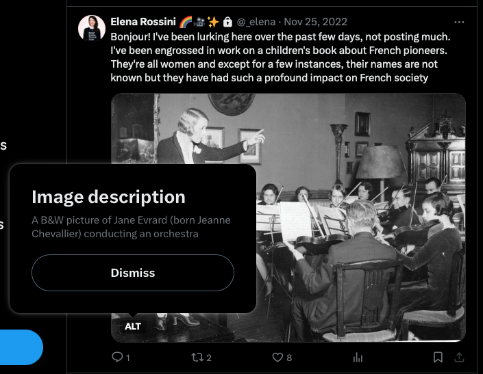
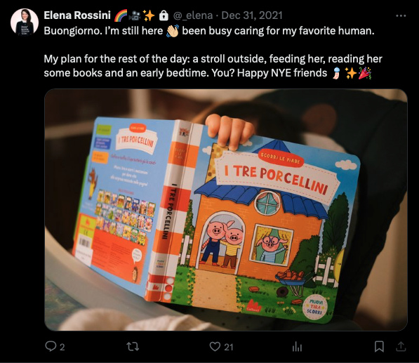
Left: a screenshot of a tweet showing a photo of orchestra conductor Jane Evrard that had alt text. Right: a photo of a tweet showing the photo of a book (I Tre Porcellini) being held by a baby's hand - with no alt text
Side note: I’m not linking to these posts because I set my Twitter account to private in early 2023. I am not deleting the account for fear of username cybersquatting.
Ouf. This is my mea culpa. I feel terrible I rarely added alt text. I didn’t know.
In the Fediverse, it’s a whole different story - and there are no excuses for such poor etiquette.
The Fediverse’s strong tradition of championing accessibility
As FediTips explained in this post:
There's a strong tradition on here that you should add alt text descriptions to any images, videos or audio files you attach to a post. These descriptions are important because they make attachments accessible to blind and/or deaf people.
However, some people can't write alt texts due to their own disabilities. If that's the case, they can include the tag #Alt4Me in their post to request help. Others who want to help can reply with an alt text description and the tag #Alt4You.
Fediverse platforms and apps make it easy to notice if you forgot to add #AltText:
- on the Mastodon web interface if you add a photo to a brand new post but forget to include #AltText a yellow warning triangle with the word ALT all in caps appears in the lower left corner of the image. Subtle but very effective, alerting you there is something wrong with your media attachment(s).

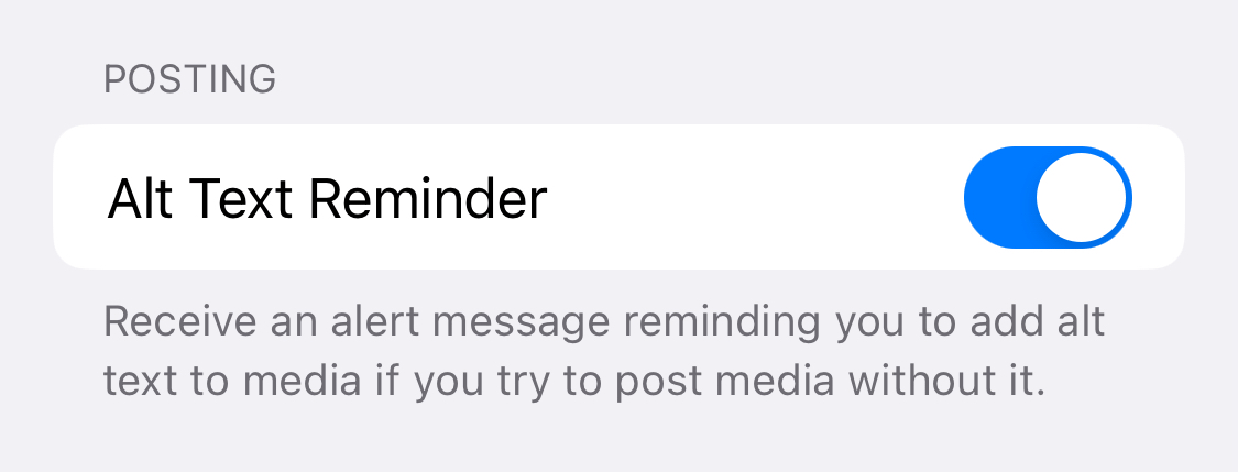
- in the iOS app Ivory (I’m not gonna call it Mastodon app because I’ve used it with Friendica and Pixelfed too) you can turn on a toggle to be reminded to add alt text to images:
- the app IceCubes “has an AI-powered image description generator” (as explained by Stefan Bohacek in this must read post)
- Android clients do the same. As @[email protected] wrote in a comment to one of my posts: “I also use it to add extra information as in my client (Tusky) it shows as a description of the image below the image itself wich I find very useful”.
- Phanpy's post composition window has a secondary text box that appears whenever you add an image to a post. It's very large and says "Image description" - so people are subtly but firmly encouraged to add alt text.
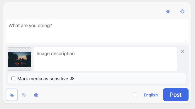
Apps and web clients aside, there are also ingenious Fediverse bots that can remind people to add descriptions to their images. As Jon Henshaw wrote to me:
“third-party clients have an option to make you enforce this for yourself, but my favorite method is to follow @PleaseCaption which alerts you when you forget to use Alt text.”
What’s an added bonus of alt text: giving context and additional information about images - even for people that do not have accessibility needs. Sometimes it’s hard to know what we are looking at and text descriptions help in that regard.
Meta’s puzzling approach to accessibility
Let’s turn our attention to Threads by Meta and see how they approach accessibility.
I don’t remember ever seeing an “alt text” toggle over a photo in my feed, to read its description. This is common in the Fediverse but not at all on Threads or Instagram.
I ran an experiment and posted a photo with alt text on Threads. Thing is, I could not read the alt text description afterwards, when the post was published. I asked my followers if they could see it and most of them said no. It was so puzzling:
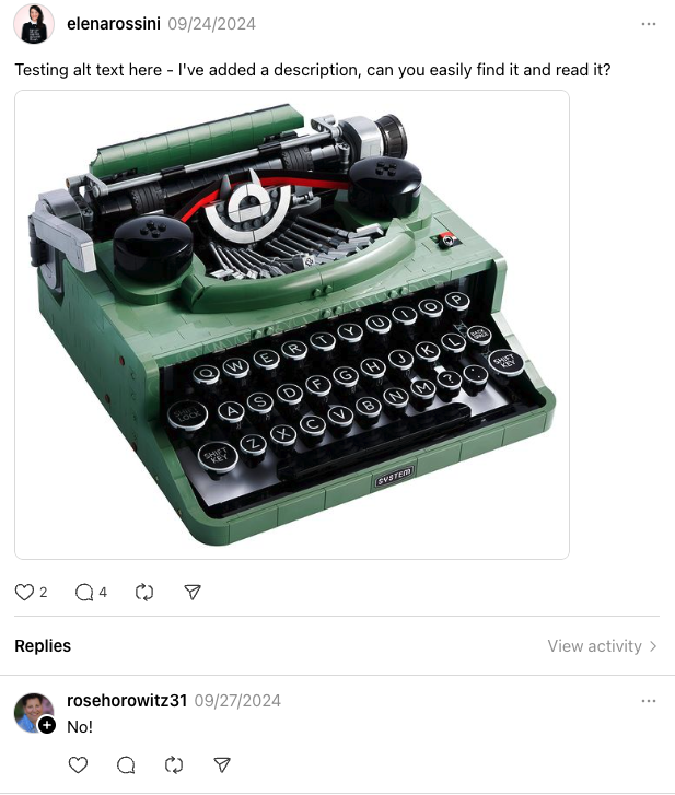
But then @mathi_gwithyas wrote to me explaining that I had to manually turn on “alt text” in my Threads settings in order to see it:
settings > account > accessibility > show alt text, then the alt text button appears on images
Want to know the real kicker? You can only do so in the Threads mobile app. There is no such toggle in the Threads web client. So while I can now see alt text in the Threads mobile app (if a user has added it), I still can’t see any descriptions on my desktop computer. None. Zero.
Naturally I pinged Threads’s @pcottle saying: “IMHO it would be nice if alt text could be on BY DEFAULT for EVERYONE, without the need to click through multiple links in settings. It's already the case on Mastodon and it drives up awareness about accessibility”
No answer.
How & why: a simple guide to alt text and why the Fediverse champions it
And if you find the idea about adding alt text daunting, there is this great, simple explainer by Alt Text Hall of Fame:
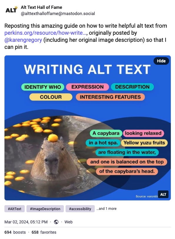
- identify who
- expression
- description
- color
- interesting features
Why is there such a wonderful ethos in the Fediverse as opposed to mainstream social media platforms?
I really like this explanation by Michał "rysiek" Woźniak:
fedi was built by furries, trans and queer folk, disabled neurodivergent people.
This is the reason the culture here is what it is. Why CWs are a thing. Why image descriptions are a thing. Why privacy matters here. Why moderation tools not only exist, but are usable — and used.
If you had joined and asked yourself "wow, how come this place is so chill and kinda… nice?" — that's thanks to all the nice people from communities some people call "weird".
So #KeepFediWeird.
In Praise of Content Warnings
I’d like to focus on another amazing feature of the Fediverse, mentioned by Michał "rysiek" Woźniak: “CWs” or “content warnings.”
You can hide the content of a post (be it text or an image/video or a combination of both) behind a warning message. In order to see the media or read the text, the person stumbling upon the post with the warning needs to click on it in order to expand it. It’s their choice whether to see the post or not.
When you are composing a message with a content warning you can give it a title and an indication why the message may be sensitive to some. Fedi Tips wrote a guide on “How to use Content Warnings (CWs) on Mastodon and the Fediverse”.
I LOVE content warnings - they are a powerful symbol of how mindful and respectful members of the Fediverse can be. For examples, I appreciate it whenever people share photos of their meals but hide them behind a content warning if there is a visual of meat or fish (which may be triggering for a vegetarian or vegan).
And it’s awesome how all photos in my Mastodon feed - on my desktop computer - have a “hide” button in the upper right corner, that allows me to blur them instantly if I find them objectionable or don’t want to see them. (Very useful to use this with photos of 3 malignant narcissists always in the news – that I do NOT want to see at all).
In the previous post about the values of the Fediverse I shared how I was turned off by thirst traps and photos that screamed “I want attention and positive validation NOW.” If I ever feel like posting a photo that does not have much value or that I perceive to be a waste of time for people of the Fediverse, I hide that behind a content warning now.
What do I mean by that? I loathe the culture of Instagram and how some people post 30 stories a day about mindless stuff. It’s the reason why I stopped going on Instagram a few months ago. I had been using it to catch up on my friends’ activities since the demise of Twitter, but it was having a counterproductive effect. I would notice how my real life friends would use it to post a lot of hollow content or doing brazen engagement bait with photos of their small children. It was making me like them less. So I rarely log onto Instagram now.
What I love about the Fediverse is that if I ever feel like posting something impulsively that’s a bit silly and of not much value, well, I can hide that behind a content warning and give it a title. So my followers can decide whether or not to see the post and I wouldn’t feel like I was wasting their precious time. Like this recent post about LEGOs.
I feel at home in the Fediverse because I think this way and I know many other people feel the same.
Toddlers vs. adults, individualism vs. collectivism
Fediverse platforms have often been described as “anti-viral” by design but I think a better way to describe them is: “mindful.” There is a lot of care and consideration about the feelings of others.
If mainstream social platforms are inward facing - “look at me, look at me, pay attention to meee right now!” - I feel that the Fediverse with its accessibility features and content warnings is outward facing, thinking about the community first. It’s the difference between a toddler whose brain is not yet fully developed and an adult. I know something about this, as the mother of an actual toddler.
I think the analogy to toddlers is appropriate for this discussion. I don’t think people of the Fediverse are innately good and considerate and people on mainstream social media platforms are innately self-obsessed and dismissive of others’ feelings. The latter group does not know about accessibility needs... because they have never been told about them. It all comes down to education and awareness. There is little awareness about accessibility issues outside the Fediverse.
Maybe a better way to describe the stark difference between the culture of Big Tech platforms and the Fediverse is this: in my opinion X, TikTok, Instagram and Threads are individualistic, whereas the Fediverse is collectivistic, prioritizing the needs of the group.
How alt text would undermine thirst traps
X, Instagram and Threads aren’t really encouraging their users to add alt text to their images and videos. This simple and considerate action would cause friction making one spend time adding a description to multimedia attachments in order to make them accessible.
No, Instagram, Threads and other platforms want their users to be able to post quickly, at their hearts’ desires, without much thought put into it.
But! Imagine if Instagram “momfluencers” - who share photos of their families’ every private moment - began to add alt text to their images. Things would get awkward, fast. All kinds of alarm bells would go off in their heads, thinking: “this feels inappropriate.” Alt text could read: “photo of a 3-year-old blond girl in a bikini crawling on all fours at the beach smiling at the camera on a sunny day” (recent photo from an actual influencer account with over 1 million followers).
Thirst traps would seem instantly embarrassing: “selfie, shot in the mirror, showing a 20-something man holding in his mouth the rim of a blank tank top in order to reveal his bare chest. He is winking at the camera” (actual photo of someone I found on Instagram when I looked up “thirst trap”).
See, if we were to put more thought into what we published online - instead of mindlessly hitting “post” on trivial messages and thirst traps, looking for attention - the culture of our online worlds would change. Radically so. This is why I love the Fediverse: yes, it represents the open social web, but also the mindful social web.
I wouldn’t be anywhere else. Well, except on Threads, just to politely encourage people to move to the real Fediverse.
Borrowing words from poet Maggie Smith: “we could make this place beautiful.”
Elena
P.S.: while I was in the process of writing this piece I realized how my Mastodon display name was potentially an accessibility nightmare. A screen reader would have read it as “asterism symbol, Elena Rossini, asterism symbol, pencil emoji, sparkles emoji, camera emoji” - so I ended up changing it and only kept one asterism symbol after my name. Apologies if the previous display name made reading my toots with a screen reader difficult.
P.P.S.: you can find all the previous issues of The Future is Federated at this link
💓 Did you enjoy this post? Share it with a friend!
👫 Follow me on Mastodon (my favorite network!) or Pixelfed. All my other links are available here: elena.social
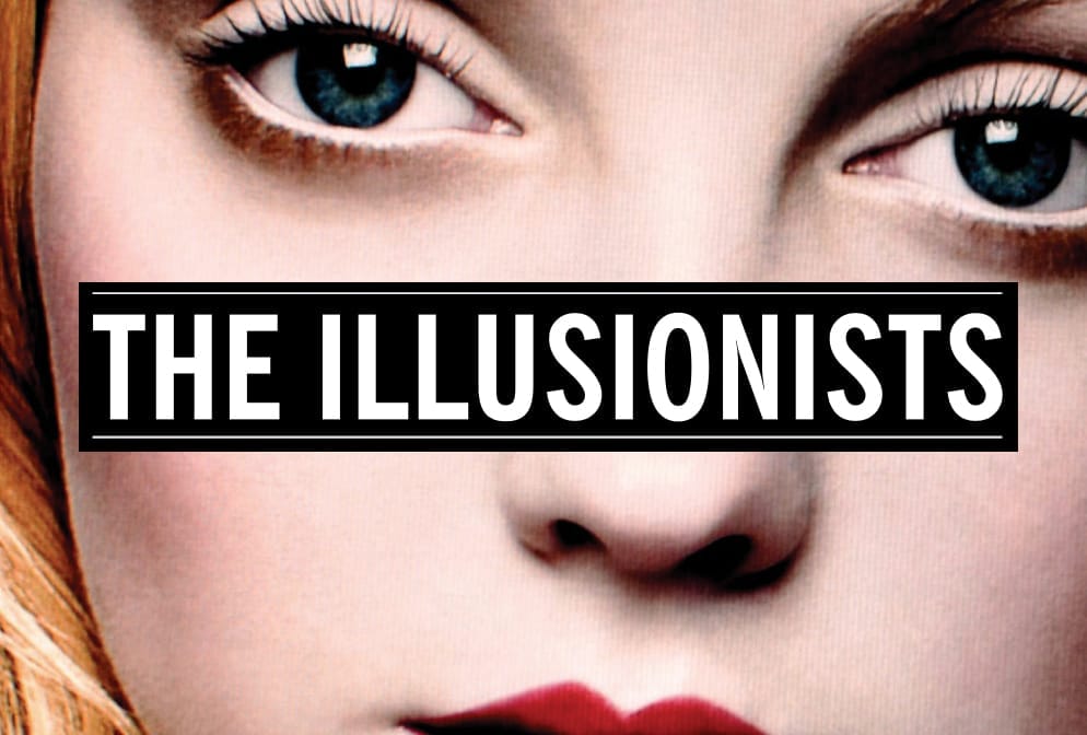
📽️ If you'd like to support my work, you could buy or rent my documentary The Illusionists on the globalization of beauty. Watch the teaser:
💌 If you'd like to say hi, my contact information is here
✏️ If this post resonated with you, leave a comment!


